Friday, September 21, 2012

Fall 2012 Interior Design Trends


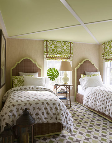
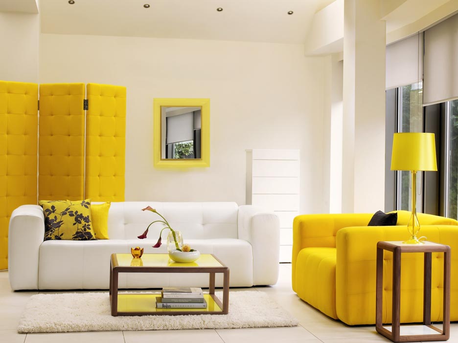
Add a punch of color with the citrus
hues trending for this fall.
With oppressive record heat temperatures, it's a good thing that cooler temperatures are just around the corner. They can't come soon enough, right? 

Along with cooler temps also comes new interior design trends and there are some great ones to look forward to this Fall.

In case you haven't noticed, (don't know how you couldn't!) the spirited neon colors from the 1980s are unabashedly back in a big way. This holds true in both the fashion and Dallas interior design worlds, as the two smartly go hand in hand.

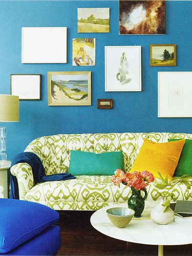
At this year's fashion shows, designers were eager to strut sassy hues such as citron, yellow, hot pink and turquoise — yet the sensible colors like black, white, cream and navy were still standing. Appropriately, this year’s color palette for home design complements what has been seen on the runways.


Looking at New Jersey-based Pantone Color Institute's preview of colors for fall, it is more than apparent the retro vibe reverberates throughout the color reports. The trending colors of this fall include Pink Flambe, Ultramarine Green and Bright Chartreuse.

Here are some other key trends we have discovered while trendspotting:

1. 2012 marks the return of sectional sofas.  Sectional seating creates a warm, inviting space for your family and friends to gather and to be more communal. Remember the so-called pit seating from the 1970s and 1980s? It’s back, only with a deeper sit. It’s all about relaxing and lounging in your space.

2. Fabrics are soft, soft, soft. Trending textures are simply luxurious — from the lightly woven velours and velvets to ultra suede. Ultra-soft fabrics, for instance, appear on overstuffed sofas to create a cozy yet chic seating combination. The style is lounge comfort. You don’t sit on the sofas, you sit in them.

3. Cocooning is still the buzz word. Interior Design experts agree people are entertaining more in their homes, and they are ready to invest in high-quality furnishings. People are eager to create luxury getaway environments in their own homes — whether through high-end home theater systems or spa-inspired bathrooms.

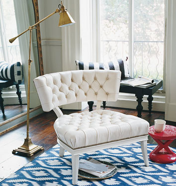
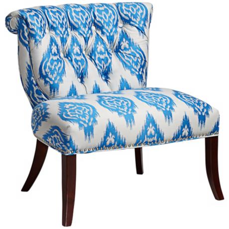
4. Everything old is new again when it comes to pattern. Traditional patterns such as chain link and Ikat are on the return with a present-day color palette. These patterns add a punch of excitement to classic and contemporary room settings.

5. Soft furnishings, including pillows, throws and bedding, and accessories are important — and provide easy ways to inject a dash of the color du jour. Many designers are mixing pillows for a fresh new look: patterns — layered on top of or next to other patterns — are definitely the current trend for home accessories.

6. Vintage is still new. Reproductions of classic pieces and remakes of vintage signs are all the rage.

7. Lastly, never underestimate the elegant durability of leather. It's a major force in the industry for its performance and luxuriance — and the way it can accommodate any lifestyle. A leather sofa, for instance, works perfectly for a family with small children since it's easy to clean. Another perk: leather lasts four times longer than any other fabric.

Want some expert assistance applying these trends? Visit us at our Dallas furniture showroom.

Wednesday, September 12, 2012

Trend Alert: Ikat

Ikat (pronounced ee-kat) is a dyeing technique used to pattern textiles that employs a resist dyeing process similar to tie-dye. The defining characteristic of ikat is the dyeing of patterns, by means of bindings, into the threads before cloth construction, the weaving of the fabric, takes place. Herein lies the difference between ikat and tie-dye. In tie-dye the fabric is woven first and the resist bindings are then applied to the fabric which is dyed.

Ikat fabrics are the oldest known patterned textiles in the world. They appear in cultures as diverse as Japan, Indonesia, Malaysia, Guatemala, Turkey, and India. Because textiles rarely survive more than a few thousand years, it is unknown how far back Ikat patterns date.

Today’s interior designers are reinventing the Ikat, using the ancient techniques and creating fresh designs. Reproduction Ikat designs allow us to use these exciting patterns in ways that we could never use antique fabrics - upholstery, drapery, area rugs and fashion.

Ikat patterned rug from Madeleine Weinrib Atelier Ikat Fabric from China Seas jazzes up a bedroom by  , courtesy of House Beautiful.
A very modern print, Bali Isle from China Seas, based on ancient Ikat patterns; photo from Domino Magazine Vendela Blue and White Ikat Upholstered Accent Chair

Thursday, September 6, 2012

What Color Where?


Are you seeing red in the bedroom, or feeling blue about your bathroom? Maybe it’s got something to do with your interior design. It’s long been recognized that colors are connected with emotions in the brain, and it’s also been proven that the colors of rooms you’re frequently in can affect your frame of mind, concentration and even digestion. 

Getting a hint of the right tint could lead to a healthier, happier, more productive home - so why not dig out your paint brushes and take a look at our rainbow of mood-enhancing possibilities? 


Green: A color that’s often used in hospitals, as it’s associated with health and efficiency. Depending on what shade you settle on, it can create very different effects: bright greens improve vision and create a refreshing atmosphere, while softer, more natural greens are calming. Mint green or heather green are welcoming shades, relaxing colors for hallways - fantastic for patterned wallpaper that’s not overwhelming. Mellower tones are also excellent for children’s bedrooms - pale turquoises and sea greens will settle them but won’t leave them feeling lethargic. As an added bonus, green doesn’t carry any gendered connotations, as do pink and blue. 

Yellow: It’s said that babies cry more in yellow rooms - a very stimulating color, it enhances concentration and speeds the metabolism. It’s often used in schools because it keeps the brain ‘switched on’ – in the home it’s great for studies and kitchens but bad for bedrooms and wind-down rooms. Pale yellow brightens an area where activities happen, giving a happy, positive atmosphere. 

Orange: Orange can make a room look smaller, so if used in excess will make a space feel claustrophobic and stressful: not so good for bedrooms and studies because you might find it hard to sleep or concentrate. However, it aids digestion and increases appetite, as well as engaging the brain. Therefore, it’s great for kitchens, eating and play areas, as well as being good when applied to a single wall in a neutral color scheme – it adds a pop of liveliness and fun. 

Red: Dark red can be a passionate color for bedrooms; rather than going all out with the same shade, it’s best to just have a ruby or maroon feature wall– too much can be unnerving rather than arousing. It’s also an appetite stimulant, so deck out your dining room with red details. 

Purple: Lavender shades are a sedative: use wisely, as they can make a living room or dining room seem drowsy. Dark, dramatic shades are fantastic in moderation but can have a bit of a depressing effect if used too much. 

Blue: Though many people’s favorite color, blue can look cold and unwelcoming. According to a study by Pantone, office workers complained that an office was too cold when it was painted blue – but when it was painted a peachy shade they warmed up even though the temperature had not changed. Blue suppresses the appetite and stimulates thought, so it’s bad for bedrooms and dining rooms; however, it’s an excellent color for studies and exercise areas.