 In any visual art, including interior design - color theory is a very important set of concepts that rule how the hues of a finished work impact the overall outcome of the project. Sometimes, it's also about mixing colors.
For a painter, it's very important to be so familiar with color that you know exactly what colors to mix together and how much of each color - to the colors you see in real life.
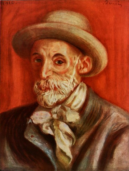
Auguste Renoir was known as one of the greatest of the French Impressionists, and for very good reason. Like the other painters of his genre and period - he rarely used black or white, rather used a never ending array of more obscure color.
He was able to model his subjects in light and shade with only the colors of his paint. Mixing and using dark, deep blues and browns instead of solid black, and simple tints of cream and other pastels instead of stark white - he, and the other Impressionists became the masters of light and shade - and 'Painters of Life'. They painted what they saw, and they knew how to open their eyes to see the world around them, and apply the simple rules of color theory to mix the colors they saw.
Certainly, when we speak of interior design, we are most definitely speaking of a visual art. Over the course of the next few months, we'll chat about some basic rules of color theory that effect the outcome of the design of an interior space, and explain why and how it applies.
Color theory doesn't just end with knowing how to mix paint like Renoir and other painters throughout history.
For an interior designer, it means knowing how to use color - to enhance the light, the shade, the mood and energy of a space. It's simply knowing how to COMBINE the colors in an area without invoking a heart attack or blurred vision.
(I promise this c
an happen when you mix the wrong colors! Well, ok, maybe I am being a little dramatic - maybe it won't cause full-blown cardiac arrest - but one part of color theory -
simultaneous contrast - which we'll go into more detail later - can definitely blur one's vision, and is the source of many graphic/visual illusions - and must be dealt with carefully with regard to the visual art of interior design. Check out the link above for some color fun.)
So as we start on our journey to learn more about color, we should start with the
basic color wheel.
Notice there is no blac k or white.
 This is because - all color - is actually
light. This is why it's called a 'spectrum' of color, because it's the color of the light along the spectrum that actually allows the eye to see color.
So - from now on, when someone tells you their favorite color is 'white' - you can retort with, "hmmm.... that's funny - because white is not actually a color - it's presence of ALL light." - and likewise, if they say "black" is their hue of choice, you can say, "But black is not a hue at all! It's absence of ALL light!". It's true! Black occurs when there is NO light, and white occurs when there is ALL light. The colors in between are the 'spectrum' of light in between.
Think of a rainbow, there's no black or white on a rainbow. It's simply because there IS light, but not ALL light. You're seeing the spectrum in the middle.
The other parts of the color wheel you learned in kindergarten, but might have forgotten. You've got your PRIMARY colors (yellow, red, and blue) - these are the 'parents' of ALL colors. (Yes, even colors have families, parents and children! We'll get into parent colors and how to see them later on.) From yellow, red and blue come the SECONDARY colors: orange, green and violet. When you take the primary colors, and mix them with the secondary colors - it breaks the wheel down even further with TERTIARY colors such as red-orange, blue-green, yellow-green and so on. They can be broken down even more, into millions of hues.
Colors exactly OPPOSITE each other on the color wheel are called COMPLIMENTARY colors - and when used together in full strength (pure hue) - that's when simultaneous contrast can occur. We'll talk a little more about simultaneous contrast, tints, shades and using colors together in a space next time. This was just a primer on the basics.
So what did we learn? Black and white: NOT colors. Primary colors: they're the super-parents of all color. And Renoir: was one hip Impressionist who knew how to mix some mad paint.
Check back in a few weeks for Color Theory and Interior Design - Part II where we'll go into some more concepts, and start tying in tips and tricks of using color in an interior design.


