Showing posts with label color theory. Show all posts

Tuesday, September 16, 2014

Why Do You Need An Interior Designer?

In the wake of television shows that make home decorating and design appear so simple and easy it might seem to make sense that you can do it all by yourself.

The truth is that design mistakes can be very expensive, in terms of time and money and in your overall happiness with the final result. To achieve the refined look of an interior designer requires a blend of training and talent that produces successful results only after years of experience. J. Douglas Design can help you avoid the pitfalls of a disappointing project and ensures that you are happy with your newly decorated interior.

Both as expert listeners and as a partner for you to bounce your ideas off, we help you stage your design plans to remain within budget while listening and working with you to achieve your lifestyle requirements.

Some of the common design errors that an interior designer helps you avoid include:

• Lack of experience with material availability and quality
• Color schemes that are bland or uncomplimentary
• Furniture and objects that are too numerous (or the wrong scale), creating a cluttered look
• Style and fabrics are not complemented or offset from room to room
• Purchased materials and furniture that don’t meet your needs or last
• Remodels that look like afterthoughts and don’t flow with the rest of the house
• Highlighted areas and lighting that are not used properly

The benefit to the client using an interior designer’s services as opposed to a contractor or architect is that an interior designer starts the design with how the people who live in the space use it and works out from there to make the space fit them. It should be both beautiful and functional to be a successful project.

By enlisting the help of a professional, you will not only save countless hours of researching and shopping, but also the worry and uncertainty about your decisions. An interior designer can save you money by doing it right the first time. To learn more specifics contact us.

Wednesday, June 11, 2014

Color Theory and Interior Design - Part I

In any visual art, including interior design - color theory is a very important set of concepts that rule how the hues of a finished work impact the overall outcome of the project. Sometimes, it's also about mixing colors.

For a painter, it's very important to be so familiar with color that you know exactly what colors to mix together and how much of each color - to the colors you see in real life.

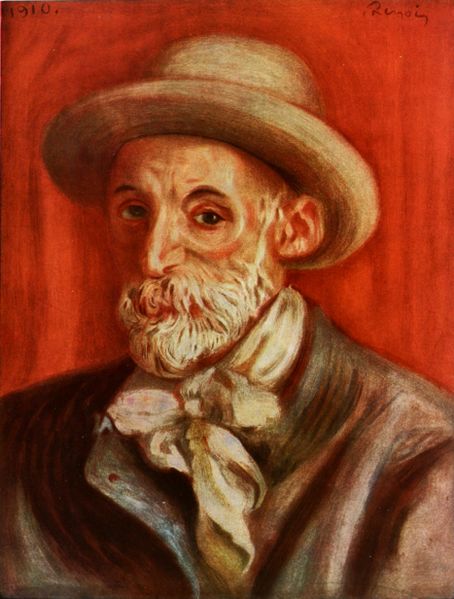
Auguste Renoir was known as one of the greatest of the French Impressionists, and for very good reason. Like the other painters of his genre and period - he rarely used black or white, rather used a never ending array of more obscure color.

He was able to model his subjects in light and shade with only the colors of his paint. Mixing and using dark, deep blues and browns instead of solid black, and simple tints of cream and other pastels instead of stark white - he, and the other Impressionists became the masters of light and shade - and 'Painters of Life'. They painted what they saw, and they knew how to open their eyes to see the world around them, and apply the simple rules of color theory to mix the colors they saw.

Certainly, when we speak of interior design, we are most definitely speaking of a visual art. Over the course of the next few months, we'll chat about some basic rules of color theory that effect the outcome of the design of an interior space, and explain why and how it applies.

Color theory doesn't just end with knowing how to mix paint like Renoir and other painters throughout history.

For an interior designer, it means knowing how to use color - to enhance the light, the shade, the mood and energy of a space. It's simply knowing how to COMBINE the colors in an area without invoking a heart attack or blurred vision.

(I promise this can happen when you mix the wrong colors! Well, ok, maybe I am being a little dramatic - maybe it won't cause full-blown cardiac arrest - but one part of color theory - simultaneous contrast - which we'll go into more detail later - can definitely blur one's vision, and is the source of many graphic/visual illusions - and must be dealt with carefully with regard to the visual art of interior design. Check out the link above for some color fun.)

So as we start on our journey to learn more about color, we should start with the basic color wheel.

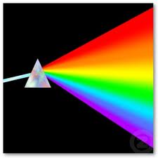
Notice there is no black or white. This is because - all color - is actually light. This is why it's called a 'spectrum' of color, because it's the color of the light along the spectrum that actually allows the eye to see color.

So - from now on, when someone tells you their favorite color is 'white' - you can retort with, "hmmm.... that's funny - because white is not actually a color - it's presence of ALL light." - and likewise, if they say "black" is their hue of choice, you can say, "But black is not a hue at all! It's absence of ALL light!". It's true! Black occurs when there is NO light, and white occurs when there is ALL light. The colors in between are the 'spectrum' of light in between.

Think of a rainbow, there's no black or white on a rainbow. It's simply because there IS light, but not ALL light. You're seeing the spectrum in the middle.

The other parts of the color wheel you learned in kindergarten, but might have forgotten. You've got your PRIMARY colors (yellow, red, and blue) - these are the 'parents' of ALL colors. (Yes, even colors have families, parents and children! We'll get into parent colors and how to see them later on.) From yellow, red and blue come the SECONDARY colors: orange, green and violet. When you take the primary colors, and mix them with the secondary colors - it breaks the wheel down even further with TERTIARY colors such as red-orange, blue-green, yellow-green and so on. They can be broken down even more, into millions of hues.

Colors exactly OPPOSITE each other on the color wheel are called COMPLIMENTARY colors - and when used together in full strength (pure hue) - that's when simultaneous contrast can occur. We'll talk a little more about simultaneous contrast, tints, shades and using colors together in a space next time. This was just a primer on the basics.

So what did we learn? Black and white: NOT colors. Primary colors: they're the super-parents of all color. And Renoir: was one hip Impressionist who knew how to mix some mad paint.

Check back in a few weeks for Color Theory and Interior Design - Part II where we'll go into some more concepts, and start tying in tips and tricks of using color in an interior design.

Monday, March 17, 2014

Green: Lucky Interior Design?

Is green the color of luck? It's certainly associated with the American version o the holiday St. Patrick's Day, along with the four-leaf clover and pot o' gold. But what about using the cool color as the base of your interior design?
From a an interior designer's point of view, (ours in particular) green is a wonderful color. All shades of it, too - from muted gray-greens, to blue-based teal colors, to limey and pea greens that lean more on the yellow side - are quite calming and beautiful. But for some reason, to us - they seem to work better as a compliment, or accent color, as opposed to a highly-saturated focus color for a space.
Of course, one of the colors of the year for 2012 is a nice soft green color called Margarita. We'd love to use it in a design, we just don't want a margarita couch, carpet and window treatments in the same space.
We put some images out on Facebook to our fans, and the response on the green design we put out there was pretty clear: a lot of green doesn't work. Why? There were several reasons, mostly for the image we chose to ask about it was a very soft sea-foam green, and reminded respondents of a hospital room. The overall feel was sterile, 'too' cool, and there was no dynamic or pop to the room.
Green can, however - do many GOOD things in a design. It can bring nature indoors, and is well-suited for nearly any room in the house as an accent. It can bring a feeling of freshness, cleanliness and cool, light beauty to a space when used in conjunction with other colors, or not as the main focus of the room. Pair it with white, black, gray - and let it twinkle in and around the design to accent the rest.
Yellow-based greens like limes, chartreuse - seem to naturally pair with woods, and the contrast of a deep darker wood tone has an especially nice appeal.
For the softer blue-based misty greens, these bring calming effect to the space, and nearly blend in nicely with any palette.
If you're just a green kind of person, and you must have green as your focus color - pick one of those green's that's not EXACTLY green - such as an olive or gray-green. The grays and browns in these greens pull the neutral tones out of the green, and the green sort of takes the backstage. It's there - but very subtle and not overwhelming.

Tuesday, November 5, 2013

Interior Design Elements: What Is Color?

There are so many different colors in the vast world; such as various shades of colors found in nature, or brighter hues and tones of paint on a canvas. But, how do we get all of these colors? Well it might surprise you to know that we actually get all colors from the way our eye perceives light and the way materials either absorb or reflect this light.

How could this be? Well it’s simple – you just combine the lights in different ratios. By changing the brightness in certain different colors you can get every color you could ever imagine. Millions.

In the world of painting, we use additive coloring to get lighter tints (basically, we mix white with the color to get a tint), and to get a shade, we would add black to produce shaded versions of the same color.

But in other industries, and in color theory itself - additive coloring is a bit different, where for example, combining all three additive primary colors in equal amounts will produce the color white itself. Good examples of this include televisions and computers.

What happens, though, when the source of your color is not light, but instead is something like a book or photograph? Well it’s easy – we just use Subtractive Coloring instead. Subtractive Coloring’s colors are Cyan, Magenta, and Yellow. What makes Subtractive Coloring different from Additive is that in Subtractive the three colors are used to make darker colors, and when all three are mixed together they create the color black. For all you Photoshop experts out there - this is what happens when you 'invert' an image.

In essence, all colors are made up by how we, as individuals, see them. So, in theory, colors do not exist in nature, but instead are something that we perceive as color given three different situations: white light, the way materials absorb or reflect light, and by the sensibility of the human eye. This would also mean that colors do not exist in powders and paints or fabrics.

Some eyes can be more sensible than others, though – and at J. Douglas Design we know that we have the right eye to help you combine any types of different colors that you may want in any kind of home décor.

Wednesday, October 23, 2013

Interior Design Ideas - Incorporating Feng Shui Part I

We all want a home that looks beautiful - but it must also feel right. A home with personal energy flows well from room to room, with each room offering it’s own personality.

By learning the principles of Feng Shui, a Chinese system of harmonizing environments and elements - you can create any desired atmosphere in your home.

Let’s start by covering some simple things you can do to implement Feng Shui into your home today:

Be Clean 
Simple. Clean your home. Nothing makes a home look more inviting and welcoming than a clean living room with some magazines laid out upon a coffee table. Keep the clutter out, by organizing your things and keeping things where they belong.  Dust the floorboards and ceiling fans and change the light bulbs on the porches to create a more safe and visible atmosphere.

Be Strategic and Open Channels
Don’t leave furniture or items in the middle of rooms or entryways, these can block the "flow" of energy that moves into the home. Do you have a wall or dead end in your home that seems out of place? Add a floor-length mirror to create an illusion of a bigger room or space.

Add Shapes and Colors
Shapes and colors are both core elements of design and can do wonders to a home to revamp the interior design. To stay strict to Feng Shui principles, use rounded or oval tables and white plates to allow the food to be the focal point of the meal and room. Opt for wooden tables and soft fabric chairs instead of glass counter tops or metal table tops.

Have you tried any of these in your home? Stay tuned for more Feng shui principles you can incorporate in your home today to help create a personal energy in your living space.

Friday, February 11, 2011

Spring Is (Almost) In The Air...

All this snow and the harsh winter winds have forced many to stay indoors more than usual these past few weeks. And especially after the vibrant colors and festive music and lights of the holidays - your interior design, home furnishings and furniture might seem now just as “cold and dreary” as it has been outside. But warmer weather is just around the corner - sunshine is on it's way!

Rescue your living space from the winter doldrums by adding a splash of color, texture or an accessory! Adorn your sofa with a bold new throw, top your bare, empty mantle with a candle or display some your fabulous gallery art work on your walls.

Here are just a few other ideas for fighting the winter blues at home:
Winter whites. While there is something magical about the season's first glistening snowfall-by the time February is here, certain parts of the country (and us too after last week!) are sick of the thick white stuff. Consider some shades of white. They're light, bright, and soothing. In fact, a creamy white color scheme and sparkling accessories can actually recapture some of the magic and warmth that winter holds (without reminding us of the Ice Queen from Narnia). Line your tables with white linens and dishes. Create a warm glow with a display of white pillar candles in silver, glass or crystal candle holders. Place white roses or other equally creamy flowers in a pretty vase.

Keep It Cool.
Light greens and blues can give anyone spring fever! The colors are uber-cool - light and airy, too - and are grounded with rich, neutral grays. You can really add some 'pop' to your design by using these relaxing and calming hues. Try a sage green chair a to accent snowy white bedding, add a bit of color to your bedding with pale blue pillows. They'll enhance the mood and setting of the entire space. With color, you can design a bedroom that is tranquil, with plenty of panache, class - and - most importantly - it will be your private sanctuary.

Go Really Green. While the mounds of brown, soggy grass and droopy trees outside your window aren't exactly a pleasant sight, having fresh, bright plants or flowers inside can always perk you right back up. In a variety of unique colors and shapes, indoor plants and herbs are the perfect solution to wake up your indoor space-especially if they're displayed in a pretty pot or planter. They also improve indoor air quality.

Exciting new hues. Take the chill out of the season by adding a vibrant new color into your decorating scheme, perhaps by painting an accent wall or simply adorning sofas and chairs with plush, oversized pillows. 2011 brings a variety of luscious color trends, such as light citrus yellow, rich-vintage wine and “honeysuckle“ pink (as we learned is the Color Of the Year from Pantone and is the perfect color for Spring).

Of course, you can always contact J. Douglas Designs for more ideas to help lift your rooms out of the winter doldrums and inspire you to give your home an early spring makeover.

Monday, January 10, 2011

2011 Color Of The Year - HONEYSUCKLE

If you ask J. Douglas Designs where to get ideas and inspirations for color, you would soon learn about the Pantone FASHION + HOME Color System. Most interior decorators (and designers, painters or artists of other types) are VERY familiar with the Pantone color system, and we typically rely on Pantone’s trend predictions for color.

AND the PANTONE COLOR OF 2011 is… (drum roll...)


It's A Color for All Seasons

“Courageous. Confident. Vital. A brave new color, for a brave new world. Let the bold spirit of Honeysuckle infuse you, lift you and carry you through the year. It’s a color for every day – with nothing “everyday” about it!”

Honeysuckle is an upbeat and dynamic shade of pink. It can provoke romance and glamour, and it is the color of love's first blush. Pink delivers feel-good emotion in the same way that a beautiful flower blooms, one layer at a time. Honeysuckle is a very versatile color that can fit into any room!

In a living room, subtle touches of pink in an otherwise neutrally hued room add flair. Using color in small doses keeps a formal room from feeling overwhelming. This bold color can wake up a white kitchen or it can bathe your entire kitchen in a warm, soft, relaxing light that creates warmth and coziness. And of course, this pinkish/red hue is perfect for any nursery or a fun, vibrant bathroom for a hip teenage girl.

Contact J. Douglas Designs today to learn more about how with our award-winning furniture and interior design experience - we can help you add a little pizazz to any area of your home - even just with the right color - to turn your space into the beautiful retreat you've been waiting for.

Wednesday, September 15, 2010

Color Theory and Design Part II

Welcome back! In part I of our series on color theory, we touched on the difference between primary, secondary, tertiary and complimentary colors on the color wheel, as well as blending/mixing colors, parent colors and simultaneous contrast.

This time we will expound a little more on each of these subtopics.

Now that you’re familiar with the color wheel, let’s look at the concept of warm vs. cool colors.

Looking at the color wheel, we see that the circle is divided into two families of color that make strongly different impressions. On the left side, red, orange and yellow are referred to as warm colors and green, blue and violet are cool.

Are you beginning to mentally associate between the colors themselves and the temperature sensations of hot and cold? Good. What you’ll notice while standing in a room of warm colors is that they actually seem to raise the apparent room temperature, making spaces feel cozy and pleasant indoors in winter, while cool colors provide relief on a hot day or in a warm climate. A complimentary pair is always made up of one warm and one cool color. Therefore, before deciding on a color, take into account the size of the room, the amount of light or where it is directed.

The Effects Of Color

When the primary colors - red, yellow and blue are used together, they create a very vibrant effect, resulting in striking contrasts. Together they are very successful in small space interior design because they revitalize and rejoice.

The cool colors - blue, green or violet produce a sense of calm and quiet, and like white, creates a distancing effect, making them also ideal for smaller, narrower rooms. However, be careful not to use them alone as they can be cold and impersonal as well.

Warm tones - the range from yellow to red, are vital and happy, and give the impression of “near” space, and therefore work best in large environments.

Now that you understand how groups of colors work together to create certain effects, let’s look at a phenomenon in color theory that is very important to be aware of so as not to create blurred vision or as we jokingly mentioned in part I – cardiac arrest.

Simultaneous contrast refers to how two colors, side by side, interact with one another and change our perception accordingly. Since we rarely see colors in isolation, simultaneous contrast affects our perception of the color that we see.

For example, red and blue boxes are modified where they border each other: the blue appears green and the red, orange. The real colors are not altered; only our perception of them changes.

Since our sensation is most intense where two extremes are juxtaposed, we should be careful when using simultaneous contrast in interior design.

Artists like Van Gogh purposely used simultaneous contrast in their paintings to create a jarring unpleasant sensation for the viewer. If this is not your goal (and we hope it’s NOT your goal in your interior design!), we encourage you to be aware of color mixing that causes simultaneous contrast.

If your goal is to create intense emotion in small doses then it may help to know that simultaneous contrast is most intense when the two colors are complementary colors. Mummy cases of ancient Egypt inlaid with gold and blue lapis are a good example of this, and traditional holiday colors of green and red are too.

Whatever your interior design goals are for your space, at J Douglas Designs, we have the expertise to guide you through color theory to help you select the best furniture and home accessories for your interior spaces.